Sign Up Process Redesign Research
The Research Goals
Discover unnecessary information we ask for during sign up process (if any). Conversely, discover what information is necessary to ask for during sign up process. Then, map out a smoother and faster user flow for registration. Ultimately, understand the basic components of registration for a application like Seedstages
Step 1: The Survey
The inital question I had to set the pace for my survey was that I wanted to understand why users download Seedstages in the first place. I sent out surveys to our user base to assess preferences, attitudes, characteristics and opinions regarding the main purpose users download the app. This allowed me to count or quantify the main motivation when it came to sign up. I started with a survey as it is a quick and relatively easy way to start getting a better understanding of the market and users' needs.
Step 2: Competitive Analysis
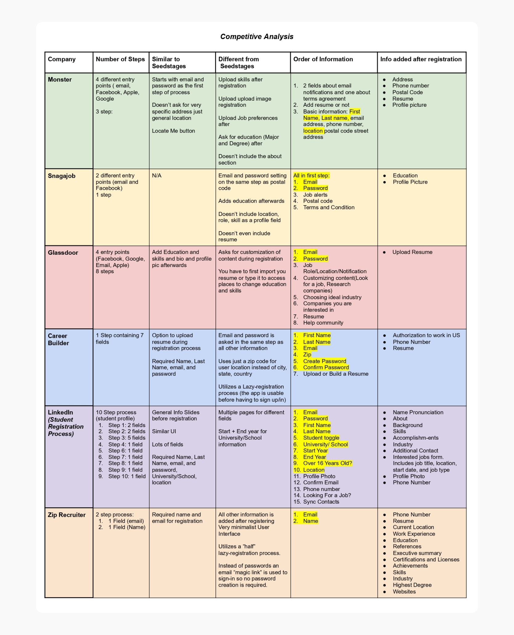
Then, I decided to conduct a competitive analysis to help me identify competitors' strengths and weaknesses relative to Seedstages own business, product, and sign up design. Knowing what Seedstages' competitors provide and do not provide is always better than guessing on my own. I started the competitive analysis by...
1. Outlining the goals and defining our product
2. Compiling a list of direct and indirect competitors
3. Creating a comparison chart of the competitions' product features
4. Identifing the differences between products
5. Summarize and present your findings
Step 3: Card Sorting
After getting a solid understanding of what fields we need and the motivations users download the app for it became evident that information architecture would have to be addressed in my research. That is, discovering how people understand and categorize information. I needed to present a way to sort the registration fields in a way that makes sense for the target audience.
Card Sorting is when participants organize topics into categories that make sense to them and group them accordingly. I figured Card Sorting can be useful for this as it can be a way to to improve the existing design or create a new design, when the goal is to understand how users categorize information and make the UI more predictable for them.
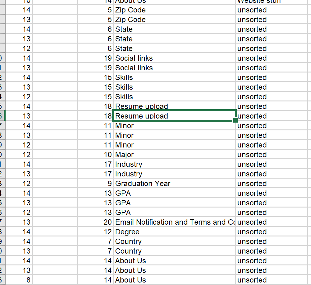
We instructed participants to leave anything they thought does not belong in registration unsorted
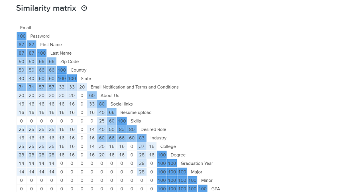
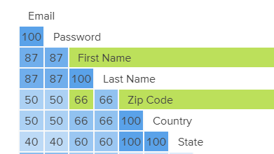
The Similarity Matrix above from the Card Sort data demonstrates the frequency of pairings being grouped together. As can be seen, the darker shaded boxes with higher percentages represent high frequency pairings. For example, 66% of participants grouped “First Name” and “Zip Code” together (refer to figure below).
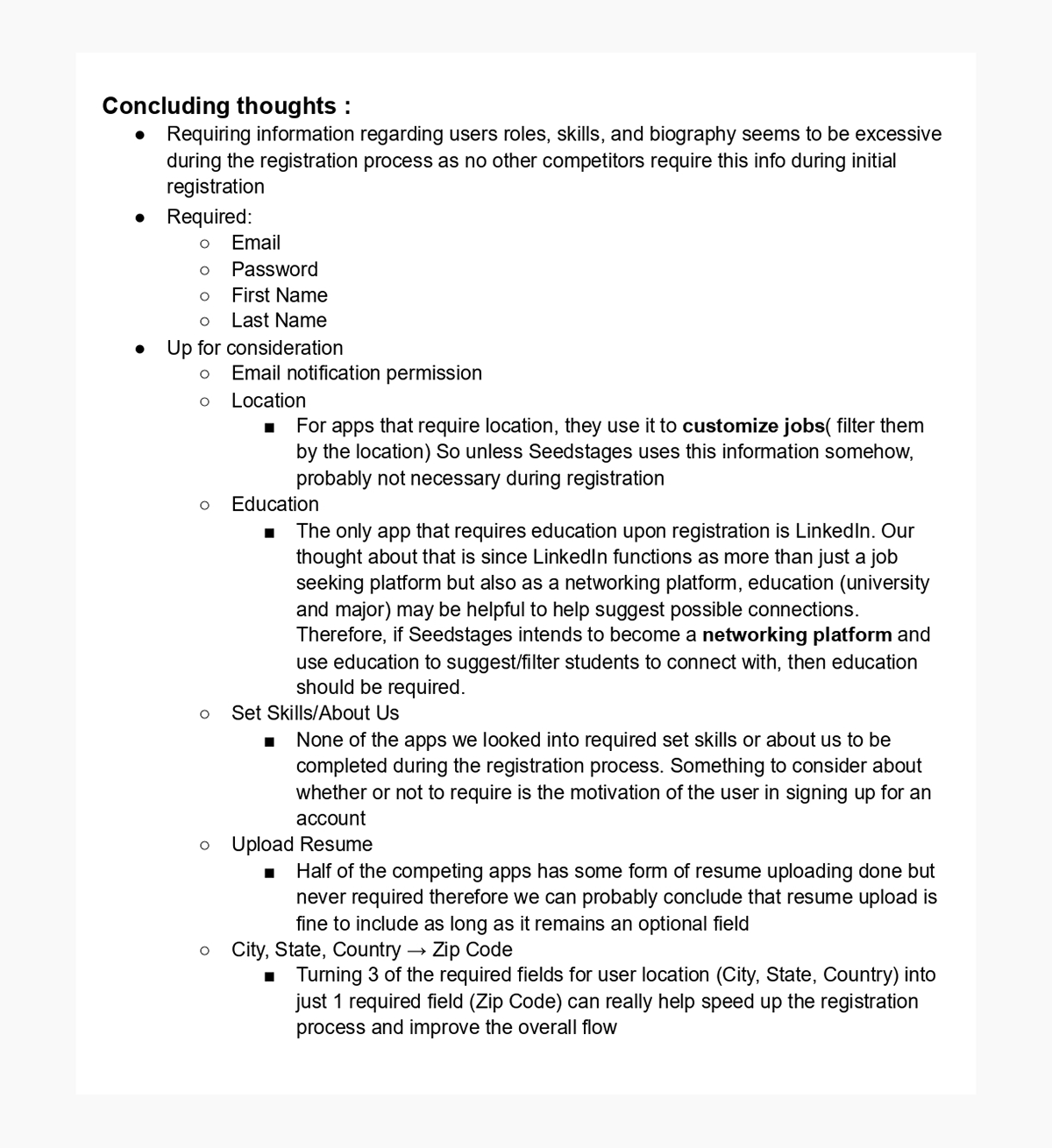
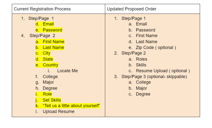
Finally, based on the competitive analysis and card sorting I was able to present the UX Design team with my proposed registration process.
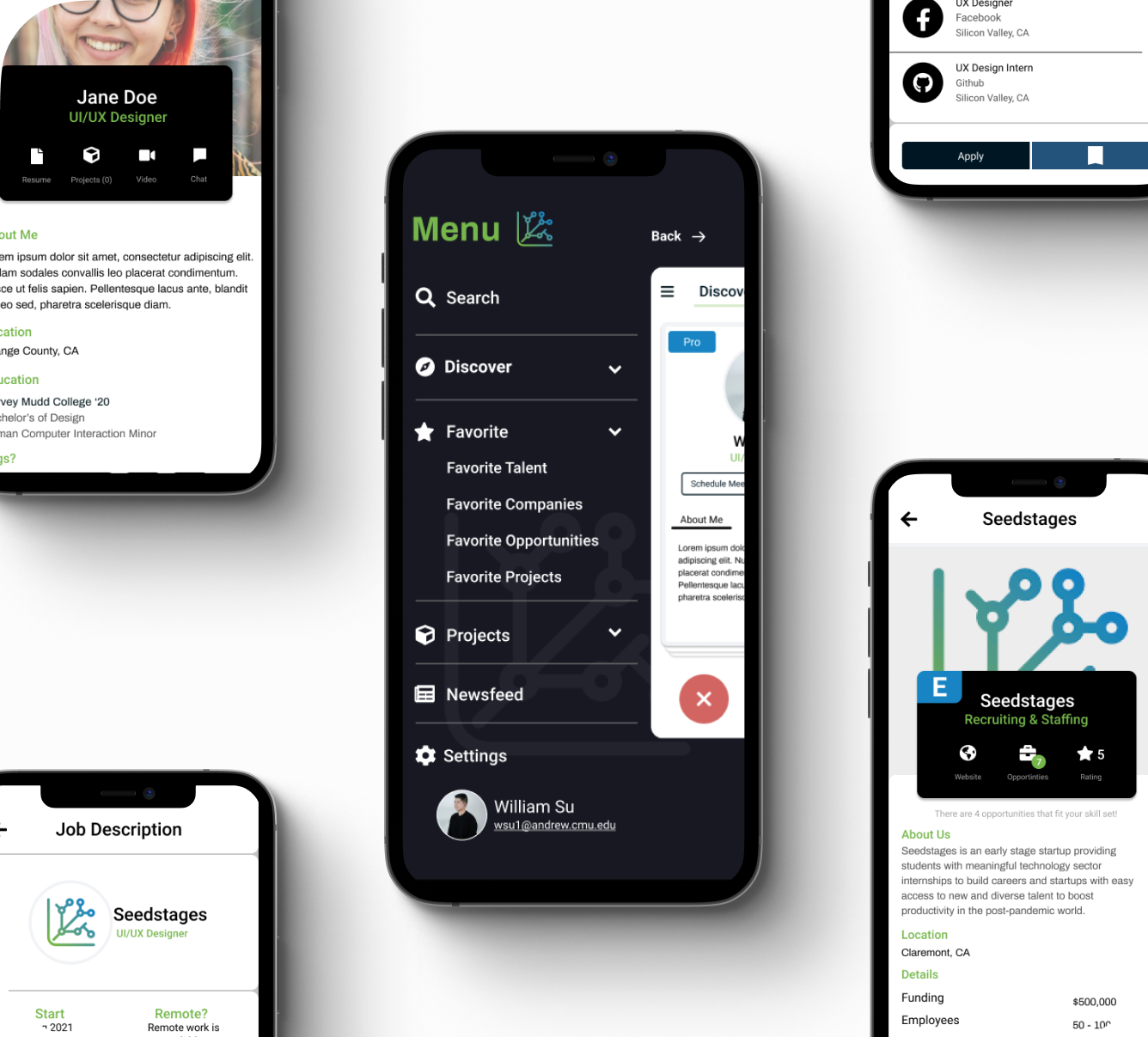
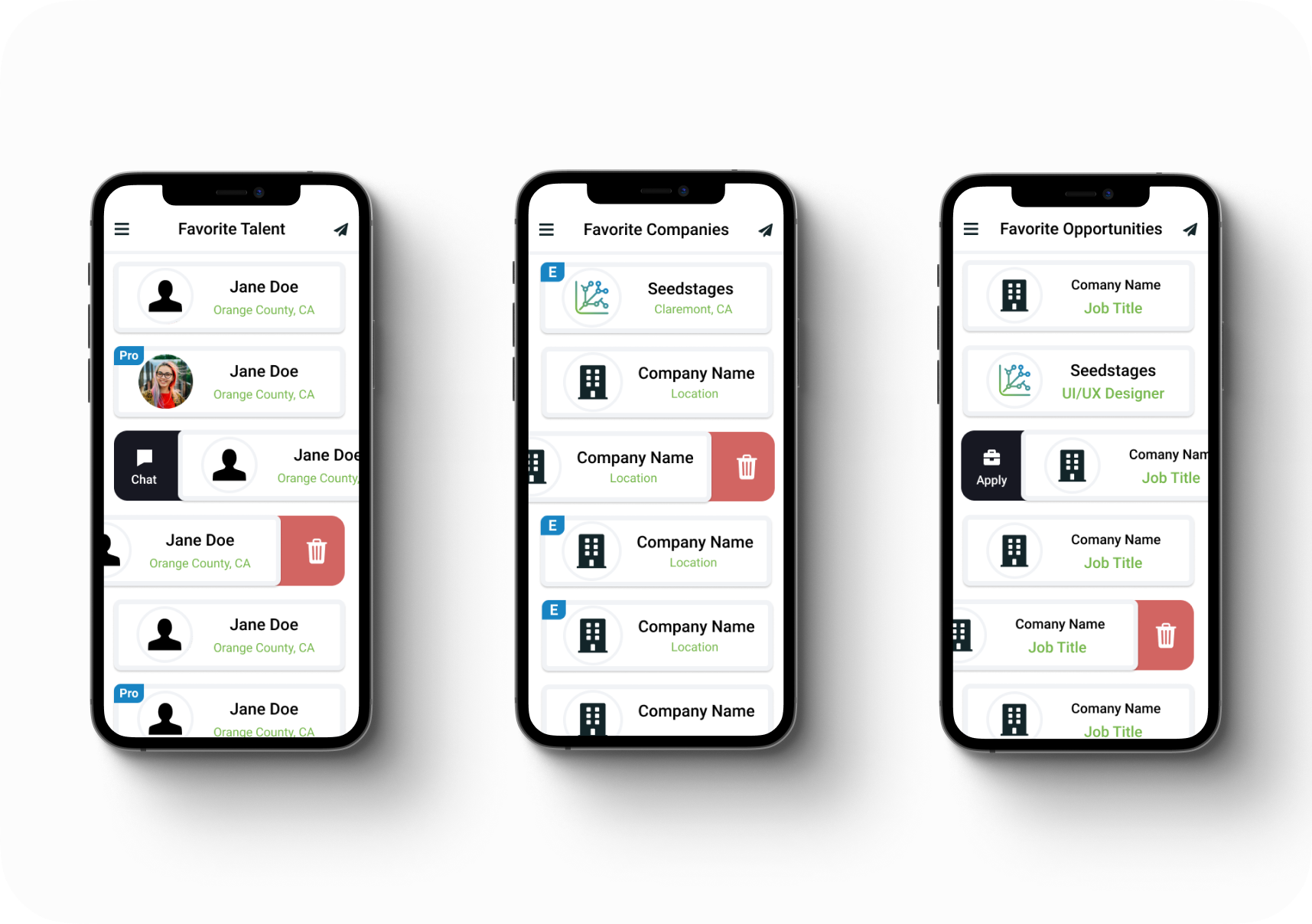
Favorites Page Design
The Design Goals
The UX Research for the favorites design was given to me by the UXR team in the form of user testing results, I then made design decisions based on these findings that I presented to the CEO, Project Manager, and UX Lead for approval. In summary of the research, these favorites pages are meant to be a place users can go to for easy access to their favorite users, jobs, and opportunities. Not only that but it should also be a place they can start their application or networking process.